If you’re just starting out with landscape painting and feeling a bit overwhelmed, don’t worry. Here’s a quick guide to help you choose the best colors for your nature-inspired masterpieces.
Getting the right colors can make a huge difference in your work.
Starting Out with Store-Bought Sets
Chances are you picked up a standard set of 12 colors from the store. That’s a great start!
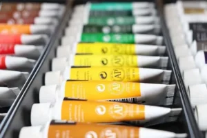
However, if your focus is on painting landscapes, you might need a few more specific shades. While you can mix primary colors to create all the hues on the color wheel, it can be a bit daunting when you’re just starting out.
Earthy Colors
In my experience, there are a handful of trusty earthy colors that I end up using time and again in my nature paintings. Here’s my go-to list of colors that I frequently end up using for various basic nature elements:
1. Skies and Water Bodies – (Blue… duh!)
But not just any blue –
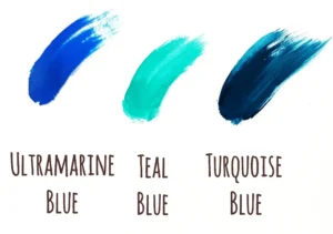
- Shades of Ultramarine, Teal Blue, and Turquoise Blue: These colors are perfect for painting the sky and water. Ultramarine gives you a deep, rich blue, while teal and turquoise add variety and vibrancy. I tend to mix and blend them to create more depth.
2. Greenery, Trees, and Foliage
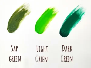
- Sap Green: This is my most used color. It’s earthy and perfect for all kinds of foliage.
- Dark Green and Light Green: These shades help add depth and variation to your greenery.
- Yellow Ochre: Great for adding a warm, earthy tone to your greens, especially in tree trunks and leaves.
3. Sun, Flowers, and Highlights
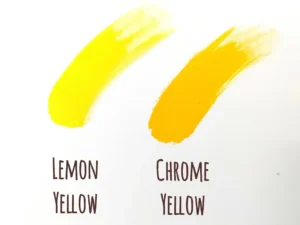
- Chrome Yellow and Lemon Yellow: These bright yellows are ideal for painting various nature elements like the sun, flowers, and adding highlights to your landscapes.
4. Barks of Trees, Rocks, and Mountains
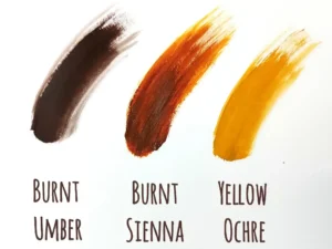
- Burnt Umber, Burnt Sienna and Yellow Ochre: These earthy browns are essential for painting tree barks, branches, pathways, boats, houses, rocks, and mountains.
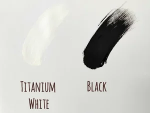
- Black: Useful for adding shadows and depth to your landscapes.
5. Clouds, Waves, and Highlights
- Titanium White: White is indispensable for painting clouds, waves, and mixing with other colors to create highlights.
Of course, the colors you use will depend on the specific painting you’re working on and your reference images. But if you’re just starting out, having these in handy will make it a lot easier to hit those nature hues!
Don’t Worry About the Brand: Focus on Learning and Experimentation
The brand of paint doesn’t really matter when you’re starting out. There are so many brands out there, each with their own variations and qualities. When you’re a beginner, it’s easy to get caught up in the hype of buying the “best” or most expensive paints, but that’s not necessary.
Focus on learning how to mix and use colors effectively rather than worrying about brand names. Whether you’re using a budget-friendly student-grade paint or a more professional one, the key is to understand how the paint behaves, how the colors mix, and how they apply to your canvas. Plus, experimenting with different brands can be a fun learning – you’ll start to notice the subtle differences and develop preferences over time.
Also note that the hue of a color is not EXACTLY the same across brands – an Ultramarine Blue from one brand might look slightly different from another brand.
What’s important is that you play around, experiment, and have fun with the colors. Over time, you’ll get a sense of which colors you gravitate towards to make your landscape paintings more natural and beautiful. You’ll then have your own set of trusty colors you end up using more often than others 😊
So grab your brushes and start painting! Enjoy the process and watch your landscapes come to life. Happy painting!
